How do you help your clients buy from you?
If you want people to buy, you have to make it easy.
The more complicated your buying process, the less likely it is that your customers will make a purchasing decision. There’s a term called “paralysis by analysis”, which is when you make things so complicated that you end up overwhelming your customer, leading them to make no purchasing decision instead of making one.
Software familiarity
Most software, apps and websites that you use as a photographer are designed by photographers. This is great because it breeds familiarity.
For example, you’re used to seeing “panels” like in Lightroom. So when you use an app that has expandable panels, it’s familiar for you.
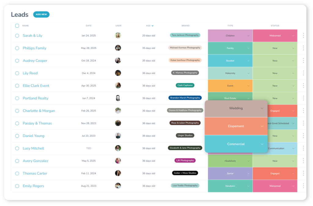
You’re used to seeing “badges” on images that have an associated action, like in Photo Mechanic, Bridge or Lightroom. So when you use an app with an actionable badge overtop of a thumbnail, it’s familiar for you.
… So on and so forth.
This is great for you; a photographer seeing familiar photographer-related visual elements. But, as soon as those visual elements go beyond you and on to your clients, there’s a disconnect. Your clients aren’t using the same software you’re using. They’re used to iPhoto, Google, Pinterest, and so on, which all have a different user interface than those we’re used to as professional photographers.
Therefore, when they use a software, app or website that has a “panel”, it’s unfamiliar to them. When they see image thumbnails with “badges” overtop of them, that functionality isn’t intuitive for them.
When your clients use a software or interface that’s built for you as a photographer, it’s complicated and overwhelming for them. Paralysis by analysis. It’s not easy for them to buy.
Helping you help your clients
With Sprout Studio, we have a deep understanding of user interface, user experience and the psychology of design. We understand who you are as the photographer and what user interface makes most sense for you, but we also understand who your customer is and what user interface makes most sense for them.
That’s why we’ve created an entirely separate design guideline for the back-end of Sprout Studio as we have for the front-end of Sprout Studio; one for you (the former) and one for your client (the latter).
We want the experience for your client to be as seamless, simple and intuitive as possible. We want to help you give a great customer experience. We want to help you sell more.
We want to help you make it easy for your customers to buy.
Intentional creation: familiarity on-purpose
These simple distinctions have a huge impact when compounded.
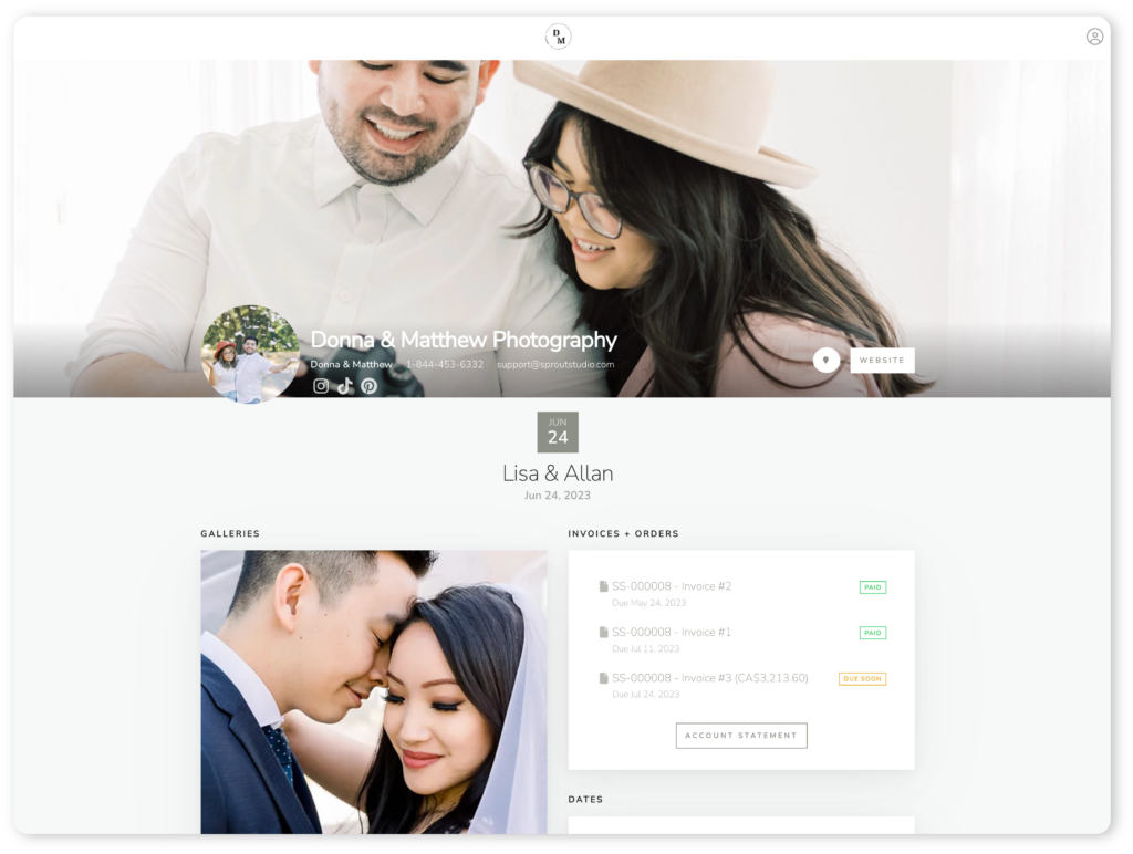
To illustrate what I mean here, let’s look at the Galleries module in Sprout Studio. This is what your clients will see when you send them a proofing gallery. We re-thought the entire interface and customer experience from the ground-up.
We asked ourselves: When a client opens up their gallery, what do they want to do? What do they need to see? How do they want to interact with the gallery? And here’s what we came up with:
When a client is viewing their online gallery, they want to look at their photos. Big. They want to browse through them smoothly, without any hiccups, slow-downs, or unexpected pop-ups. They want to be able to navigate to other images in their gallery quickly. They want to order prints with a simple intuitive interface. They want to indicate to you which images are their favourites for an album, a book or perhaps another product you’re creating for them.
If you’re offering digital delivery, they want to be able to easily download all the images at once. Sometimes though, they may want to be able to download them individually if they don’t want to grab the whole set at once.
This all sounds simple, and it seems obvious, but these small distinctions are incredibly powerful.
Instead of designing Sprout Studio as a piece of software, we’ve designed it as a series of “use-cases”, which has allowed us to really think about how the software will be used instead of just following the status quo.
This example just skims the surface of the level of research we’ve done with regards to user experience and user interface. By digging deep and really asking the question “why”, it’s allowed us to build an incredibly powerful user experience while still keeping it as simple and intuitive as possible.
How we make it intuitive
Here are a few examples of how we’re doing this for your client’s front-side of Sprout Studio Galleries.
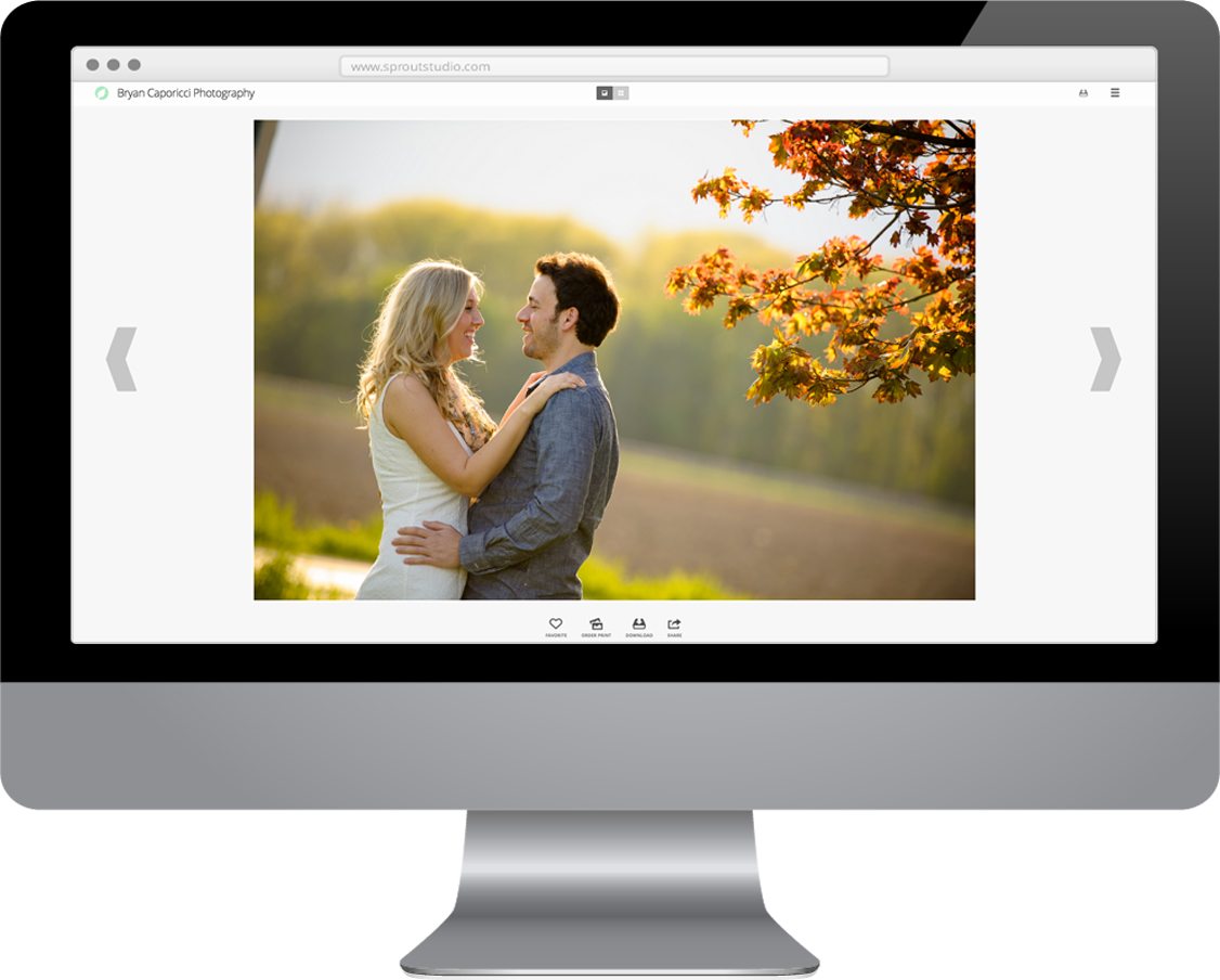
We made the intentional decision to not hide the left and right arrows. They’re always right there, up-front and centre. Your clients don’t want any surprises while browsing their gallery, and they shouldn’t have to guess what to do. It must be obvious. Also, it’s visually distracting to have elements appear and disappear, and so by keeping the left and right arrows as a static element on the page, your clients will be able to focus on your beautiful images, and not the constantly changing interface. The colour choice for the arrows was also intentional; we wanted them to be obvious enough to know that they’re there, but not have them detract from your images.
We understand eye-tracking patterns for web design. The most common pattern that most consumers subconsciously follow is the F-Pattern. Without nerd’ing out and getting into specifics, I’ll suffice to say that we’ve placed the most important elements along the parts of the page where your clients’ eyes naturally go. For example, the main “global” actions for a gallery are always along the top horizontal row, which is the first place your client’s eyes will scan. It becomes immediately obvious what they can do on that page.
Your clients aren’t used to seeing badges on thumbnail images like you are; and so we didn’t use that visual element. Instead, we put the actions along the bottom of the gallery, underneath each image. We took it a step further, we didn’t use just icons, we used icons and text, in case the actions weren’t immediately obvious. Simplicity is the name of the game!
These are just a few small examples. You can see that we’ve taken great care in everything we’ve done. Every pixel is placed exactly where it is, with intent. Nothing happens by accident.
We want to make your experience with the back-end of Sprout Studio a productive one, and we want your client’s experience with the front-end of Sprout Studio to be a simple and intuitive one.
This is just another way we’re challenging the status quo and creating with intent.
This post is another one in our Sprout Studio series, where we’ll be telling you more and more details about Sprout Studio. You can find all other posts in this series below.